Conducting analysis using ArcGIS Online tools
0. Summary:
In this step we will be creating three (3) different type of maps, and an additional feature layer to support our story.
- Species Map
- Heat map
- Proportional symbology
- Summary Statistics
1. Select the map you made in the previous step, we’re going to use it as a template to create our other maps.
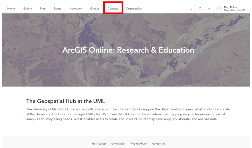
- Navigate to UM’s ArcGIS Online Portal (https://univmb.maps.arcgis.com) and ensure you are signed in.
-
Access the Content area by clicking on that option in the top navigation.
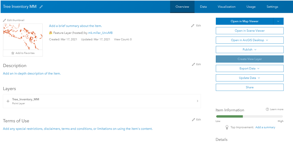
- Click the map title in your Contents area.
-
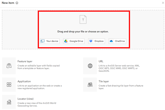
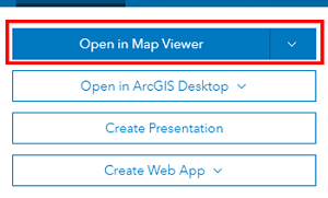
On the details page that opens, select the Open in Map Viewer option to open our map.
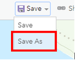
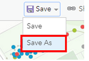
- Save multiple copies of the map to your personal content area by selecting the Save As option.
We will be creating the following maps, so save one copy for each (name it something meaningful and be sure to add your initials to the end of the filename).- Tree Species Map
- Heat Map of Trees
- Proportional Symbology Map
- When you return to your content area, you should now see four (4) maps listed.
2a. Create a Species map to show distribution around campus.
- Click the Species map title in your Contents area.
-
On the details page that opens, select the Open in Map Viewer option to open our map.
- In the Table of Contents ensure that:
- The Space Inventory is hidden
- The Tree Inventory is selected

- Select the Styles toolbar at the right side of the screen.
-
Then click the Field button.
- Check off Species in the list that opens, and then Add to the map.
- Your map should now look something like:
2b. Configure pop-up in your map for visual clarity.
Right now, our pop-up contains a lot of extra information that our audience may not be interested in:
- To edit, ensure the Tree Inventory layer is selected in your Table of Contents and select the Pop-up toolbar on the right side of the screen.
-
We can see there is a title block coming from the Latin Names_ field, a list of 30 fields, and an attachment image.
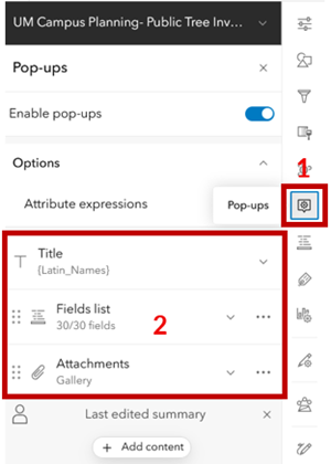
- Delete the list of fields by clicking the 3 dots to the right of the item and selecting delete.
-
Select the add content option at the bottom of the menu, and select Text.
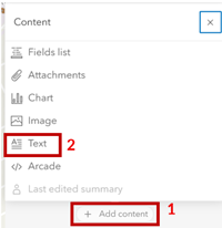
- Paste the following code into the text box and click OK:
This {Species} is listed as {Tree_Maturity} and stands at {Height}m tall, with a crown that is {Spread}m wide. We are currently updating our dataset to include names of our campus trees in Indigenous languages. The {Species} ({Latin_Names}) is known as: Michif: {Michif} Dene: {Dene} Anisininew: {Anisininew} Anishinaabeg: {Anishinaabeg}
-
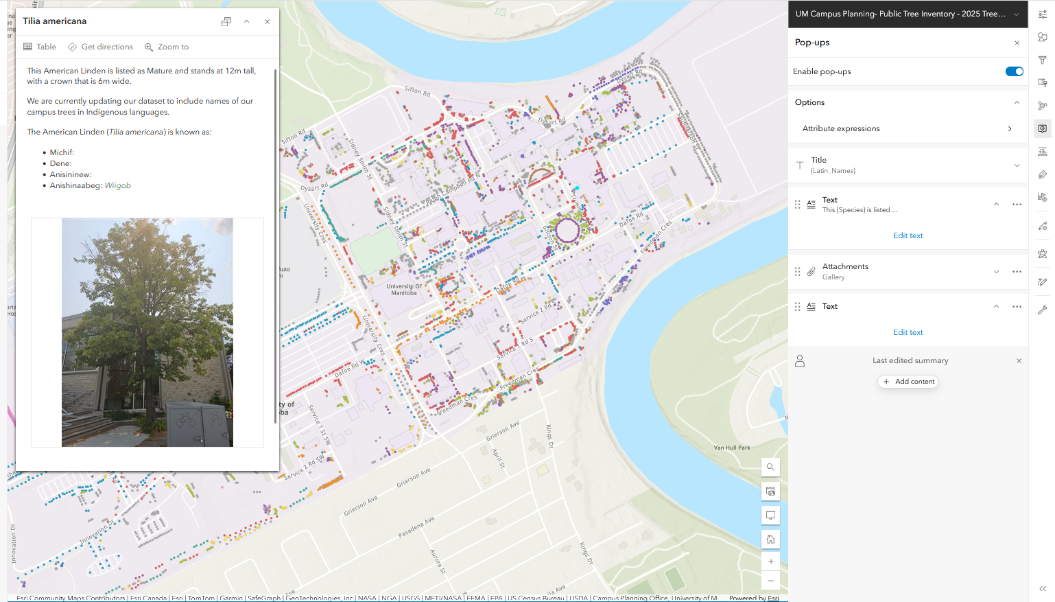
Your pop-up should now look something like:
- Don’t forget to Save your edits.
- Return to your personal content page.
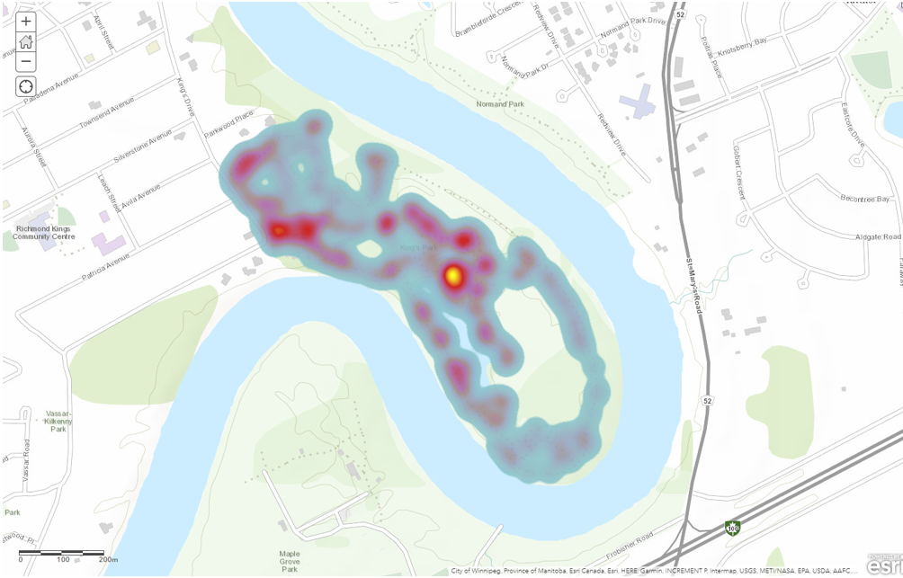
3. Create a Heat map to show distribution around campus.
- Select the Heat Map you have created from the template.
- On the details page that opens, select the Open in Map Viewer option to open our map.
-
In the Table of Contents ensure that the Space Inventory layer is hidden and the Tree Inventory is selected.
- Select the Styles toolbar at the right side of the screen.
- The style options for trees should open automatically on the right side of your screen.
- Drawing style: Heat Map
-
Explore options for Heat Map
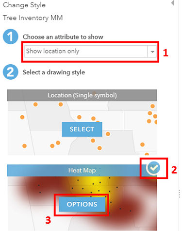
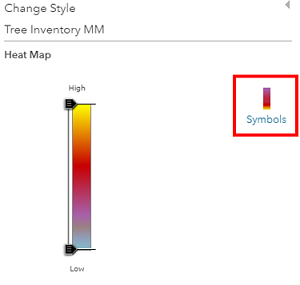
- In the Heat Map options that open select a colour ramp that works for you.
-
Your map should look something like:
- Don’t forget to Save your edits.
- Return to your personal content page.
4. Use Proportional Symbology to show relative tree sizes around campus.
- Select the Proportional Symbol Map you have created from the template.
- On the details page that opens, select the Open in Map Viewer option to open our map.
- In the Table of Contents ensure that the Space Inventory layer is hidden and the Tree Inventory is selected.
- Select the Styles toolbar at the right side of the screen.
- The style options for trees should open automatically on the right side of your screen.
- Choose Attribute: Field
- Use the checkbox to select Crown Spread.
- Drawing Style: Counts and Amounts (size), then select options.
- Choose Attribute: Field
- In the Counts and Amounts dialogue that opens:
- Symbol style: change the colour to green, adjust transparency if you wish.
- Classify: No need to check off, we just want to see the data points relative to one another.

-
Your workspace should look something like:
- Don’t forget to Save your edits.
- Return to your personal content page.
6. Re-open your newly saved Tree Species map to calculate some tree statistics for campus. We are interested in finding out species composition in the areas classified as Interactive Landscapes:
- Select the Tree Species Map you have created from the template.
- On the details page that opens, select the Open in Map Viewer option to open our map.
- In the Table of Contents ensure that the Space Inventory layer is visible and the Tree Inventory is selected.
- If you haven’t already, take a moment to explore the contents of the Space Inventory layer.
-
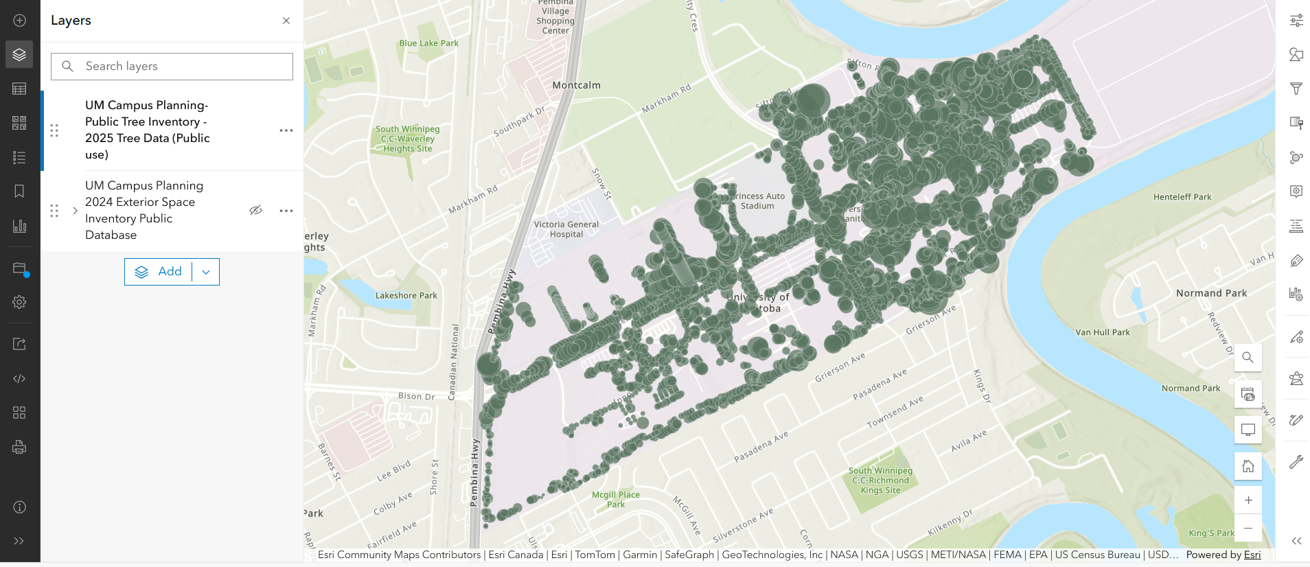
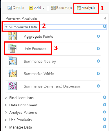
From the Analysis options on the right of your screen, open the heading to Summarize Data and select the Summarize Within option (or search ‘Summarize within’ in the search bar).
- In the Summarize Within Dialogue select the following options. Note that most options and tools have a blue circle you can hover over for more information.
- Features to Summarize: Tree Inventory
- Summary Area: Space Inventory- Interactive Landscapes
- Field Statistics: Total Height, Min, Max, Avg
- Group By: Species, add minority, majority and percentages
- Name the file something meaningful including your initials.
- Click the Run Analysis option, wait for the data to be added to the map
- Explore the Attribute table and pop-ups for the new layer you have created.
-
Your workspace should look something like:
- Don’t forget to Save your edits.
- Consider how you could use this information in a Story Map.
That’s it! We now have the building blocks to create a StoryMap in the next section!