Kumu exercise – visualizing a simple network
0. Step back:
Before diving in, we need to take a moment:
- Consider your data and what relationships you’re trying to visualize.
- Select the appropriate tool.
- Clean and structure your data.
- Open the Help document for your tool.
We have two .csv files in our data folder- one for nodes (people) and one for edges (relationships). While some tools will allow you to combine these files into one or use proprietary file types, best practice is to keep these elements separate and in a plain text format.
1. Access your workspace:
- Log-in to your free Kumu account https://kumu.io/dashboard
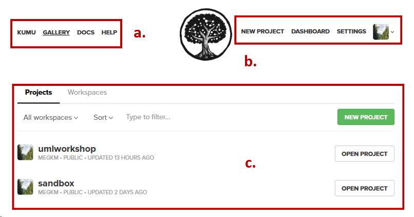
- The dashboard page is your landing page.
- Letters a-c illustrate the locations of the following elements:
- Kumu support options
- User menus (access workspaces, dashboard, account)
- Project listing (options individual projects and workspaces)
2. Create a new project workspace:
- Click on the option to create a new project from the top of the page.
- Fill out the project metadata fields to give your project a name and description.
-
Click the blue button at the bottom of the wizard to proceed to then next screen.
NOTE - Free accounts are public.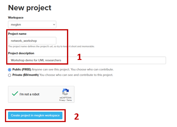
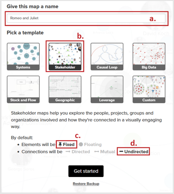
- Letters a-d illustrate the locations of the following elements:
- Map name (one project can have multiple maps).
- Select the Stakeholder template (equivalent to social network).
- Elements (nodes and edges) will be fixed in location to start.
- Connections (edges) are undirected (in our data set)
Then click the Get Started button
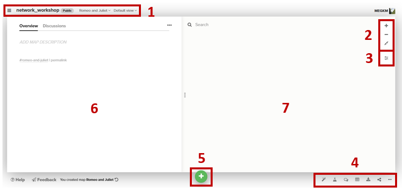
3. Explore Kumu workspace:
Numbers 1-7 illustrate the locations of the following elements:
- Kumu project space navigation (change view, delete project etc.)
- Map space navigation (to zoom in and out of your map)
- Settings (access to element properties for visualizing)
- Map actions (quick actions, metrics, data table, export and share)
- Add Data (draw nodes and edges or import from a file)
- Element overview (attributes for whatever is selected in the map)
-
Map space (where your map will live)
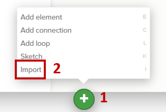
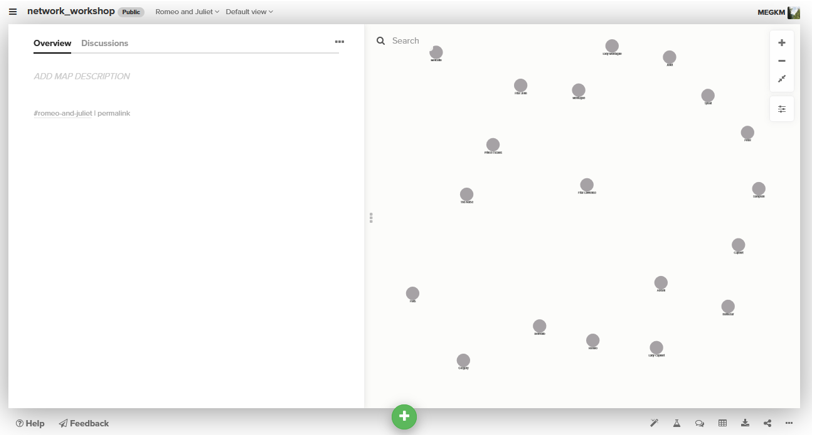
4. Import your nodes and edges data:
-
Click the green plus sign at the bottom of the page and select the import option to load your data into the map.
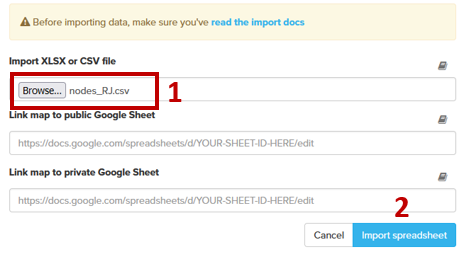
- In the dialogue that follows in the csv import, browse to your nodes_RJ.csv file.
-
Click the blue import button to proceed to the next screen.
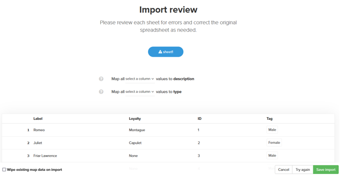
- A preview of your data appears. Double-check to make sure the fields are showing up as you expect.
-
Click the green Save import button at the bottom of your screen if all looks well.
- Your map should look something like:
-
Repeat steps 1-5 with your edges_RJ.csv file.
Note- In step 5 ensure you do not click the checkbox to overwrite existing data. This will remove your nodes data from the map.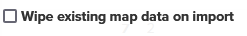
-
Your map should look something like:
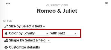
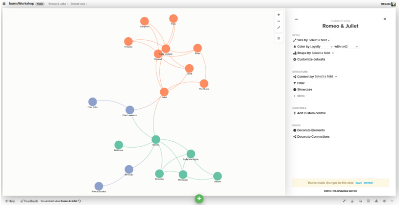
5. Adjust node styles of the map to draw out themes.
In our nodes file, we had a field for ‘Loyalty’ (Montague, Capulet or None).
-
Click the options button on the right side of the map to open the settings panel.

-
Change the Color by field to Loyalty and select a colour palette of your choice.
-
Your map should now look something like:
6. Set rules to decorate edges.
Next we want to pull out the types of relationships that are found in the data- namely who is related, which is captured in the edges data table and symbolize them with a dashed line.
In the Settings panel:
-
Select the Decorate Connections option from the list of rules (at the bottom of the panel).
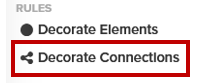
- In the dialogue box that opens, fill it out as follows:
- Decorate custom selection
- Connection Type is Family members
- Click the change style box and select the Dashed option
- Type the label Family members in the Legend text box
- Click the blue Done button to close the wizard
-
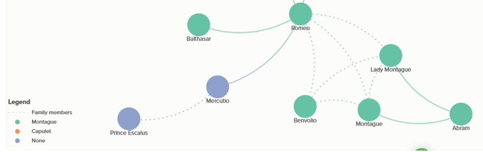
Your network map should now look something like:
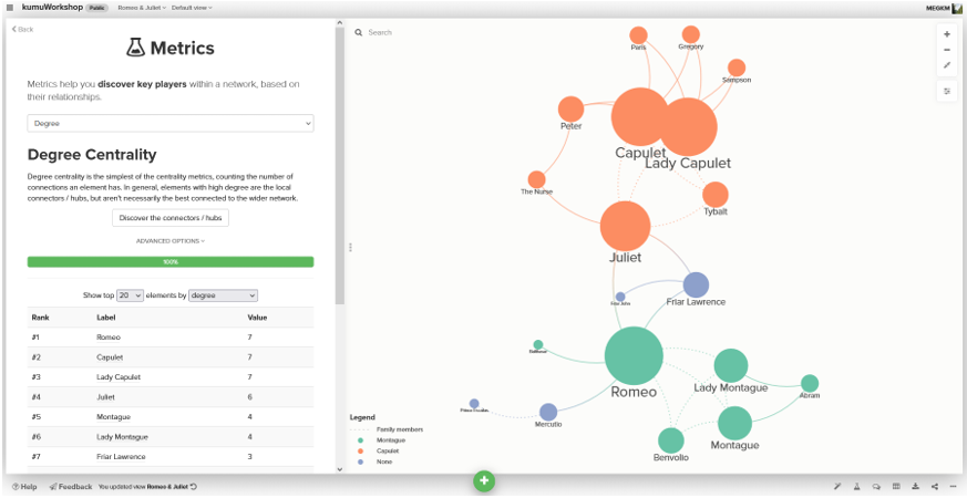
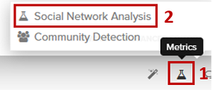
7. Calculate a metric to unlock proportional symbols.
Our current data did not come in with any degree data in the table. To be able to symbolize the nodes with proportional symbology depending on their degree of connectedness we need to calculate this metric.
-
Select the metrics option from the list of tools at the bottom of the screen, and then social network analysis
-
In the dialogue that opens select the Degree option from the dropdown, and click the Discover the connectors button.
A table will appear below the button that displays the degree values for each of our characters.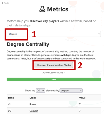
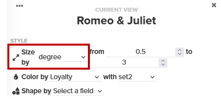
- Now when we return to the Style: Size drop-down at the top of the settings panel we have the option to symbolize.
-
Select degree from the drop-down and adjust the sizes as you see fit.
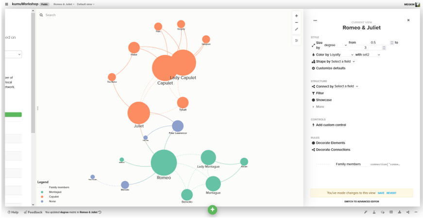
- Your network map should now look something like:
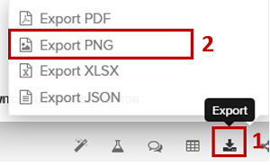
8. Make final adjustments and export network map.
You’ve taken some time to adjust colour, placement and line weights, and your map is exactly how you want it for publication.
-
Select the Export option from the list of tools at the bottom of the screen, and then the format you need.
-
The Embed option to the right of Export allows you to copy code snippet and include the live interactive network map in a website.
Congratulations! You made it through!
Questions? Concerns?
Data: Shakespeare Play Data (Kaggle)