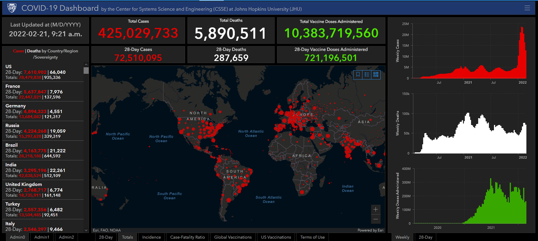
QGIS Exercise – Building the COVID-19 map
1. Load a Project:
- Open QGIS from the list of programs on your computer.
- Load the workspace Project > Open > Covid.qgz
2. Interface:
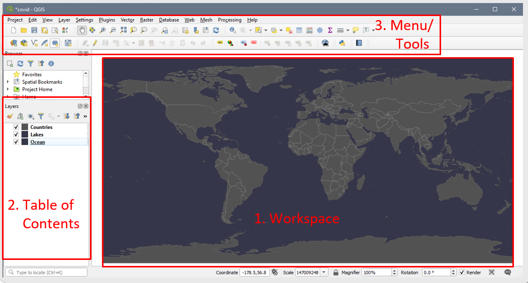
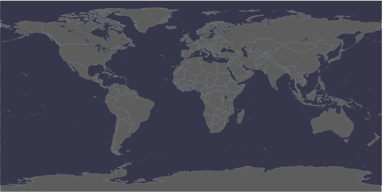
Numbers 1-3 illustrate the locations of the following elements:
- Workspace
- Table of Contents (TOC)
- Menu/Tools
3. Explore the workspace :
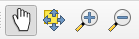
Try using the pan (hand) and zoom (magnifying glasses) to move around the map.
4. Explore the Table of Contents
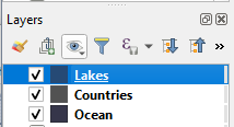
- There is a Lakes file listed in the TOC but it is not visible on the map:
To makes the Lakes file visible, drag it up the list so it is above Countries file.
Your map should now look something like:
- Right click on the Countries layer, open the attribute table , if we want to map COVID cases, what information is missing from the Countries file?
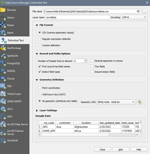
5. Adding data from a .csv file:
- There are multiple ways to add a .csv file to QGIS. The most efficient is:
Layer > Add Layer > Add Delimited Text Layer - Click the button to the right of the File name text field and select the covidData.csv file in your data folder.
- The wizard auto-fills. Ensure that:
- File Format : csv
- Record and Field Options: First record has field names + detect field types
- Geometry Definition : No Geometry (attribute table only)
- Ensure the preview looks accurate
- Click Add button
6. Perform a Join to add the data from covidData.csv to the Countries file.
- Right click on Countries and select Properties >
 (Joins) to open the dialogue box.
 - Click the plus sign at the bottom of the dialogue to create a new Join.
- In the wizard, ensure that:
- Join Layer: coviddata
- Join field: iso_code
- Target Field: ISO A3 EH
- Check off the option to cache join layer in virtual memory
- Click OK
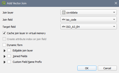
- Right click on the Countries layer, open the attribute table ,now the COVID numbers have been appended to the end of the attribute table.
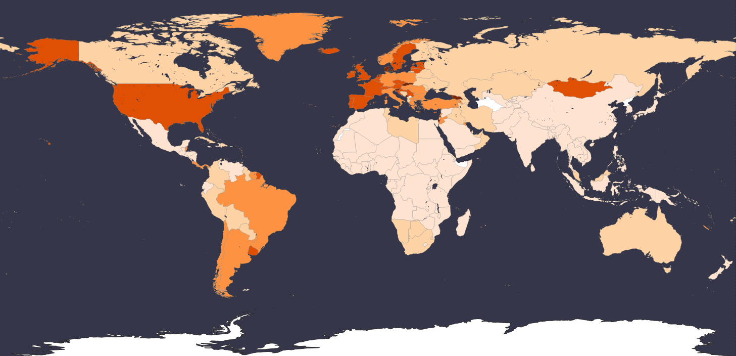
7. Create a Choropleth
- Right click on Countries and select Properties >
 (paintbrush) to change the symbology
 - Symbology type : Graduated (from the dropdown)
- Column : covid data Percpop infected
- Colour ramp : Anything light to dark
- Mode : Natural Breaks (Jenks)
- Classes : 5
- Click Classify to classify your data
- Values : Adjust the class cut-offs as you see fit by clicking the values
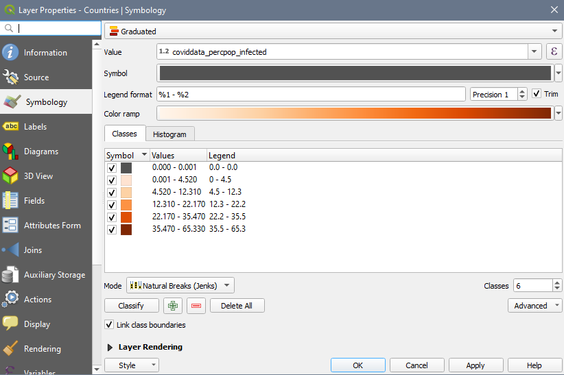
- Click Apply + OK
8. The countries with joined data are now symbolized according to the percentage of the population that has been infected.
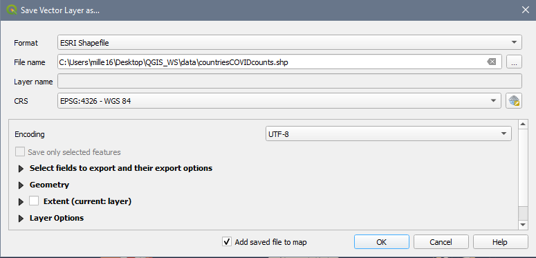
9. Export data to a shapefile format so that it can be used in analysis.
- Right click on your Countries layer in the TOC
- Select Export > Save Features as
- Format : ESRI Shapefile
- Click the button to the right of the File name text field and select the appropriate directory to save your new file with the rest of your data, name it something descriptive like CountriesCOVIDcounts
- CRS: EPSG: 4326 – WGS 84
Congratulations! You made it through!
Questions? Concerns?
Data:Natural Earth, JHU CSSE COVID-19 Data Repository