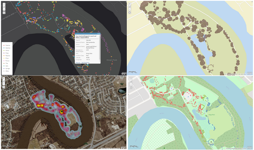
Step 3: Analyzing & Visualizing
Getting Started:
Select the appropriate analysis techniques for your data.
Symbology choices should clarify your theme.
Key Questions - Analysis
- Is your data continuous or discrete?
- Are you blinding people with science?
- Is your analysis meaningful?
Key Points - Symbology(1)
- If classifying, 3-5 classes are ideal (5-7 at most).
- Use hue for discrete data, value for continuous.
Key Points - Symbology(2)
- Give people what they are expecting to see:
(blue =water, red = bad, thick = dominant...) - If only using colour to delineate, use an accessibility checker.
Creating and updating content in ArcGIS Online