Data Visualization
(Good, Bad & Ugly)
click for slides: bit.ly/uml_dvgbu
Outline
- Define data visualization;
- Discuss visualization elements and their uses;
- Explore best practices in visualization creation;
- Explore usefulness of different display types and tools.
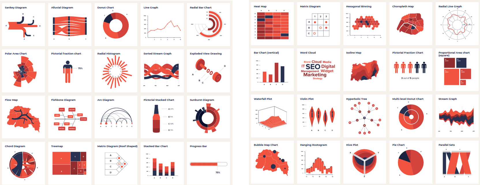
Hanging Rootograms?!
What are we focussing on?
- Information visualization.
- Display data in a way that makes it easier for your audience to explore or understand your project.
We don't want 'chartjunk' (Tufte 1983)
1. Do you know your data
2. Who is your audience
Audience- Purpose
Exploratory: Population Estimate Dashboard
Explanatory: Assisted Suicide Infographic
Font- What about ugly?
- Font has personality, select combinations appropriate for your audience.
- Keep things simple: one decorative, one for body text.
Use a tool like FontPair help with font selection.
3. What are best practices in colour selection for classification
Colour- Continuous vs discrete data
Select color schemes appropriate to your data type (shade vs. hue).
Colour- What about ugly?
- Keep things neutral with 2-3 accent colours maximum.
Use a tool like Color Picker help with colour selection.
4. What are some unconscious perceptions we have around colour
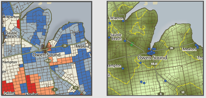
Colour- Unconscious perceptions
- Red is bad, green is good;
- Light blue shapes on maps are water;
- Light colours represent less, dark more.
Note:
Be engaged (and beware of 'universal truths').
Thanks to Vanessa Lillie, Cary Miller, Lyle Ford and Elder Valdie Seymour
for their insight in the following section.
Be engaged (1)
- Data visualization theory is a colonial construct;
- Colour has connotation outside of your own world view;
Be engaged (2)
- "Maps have killed more people than guns ever have" Dayrit (2020)
- Who are you focussing on? Who is being erased?
5. How can we take accessibility into consideration when we are selecting colour palettes
Colour- Accessibility:
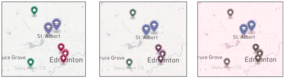
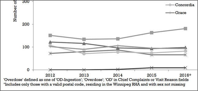
source: (Manitoba Public Health, 2017)
6. What is cognitive load, and why does it matter in visualization
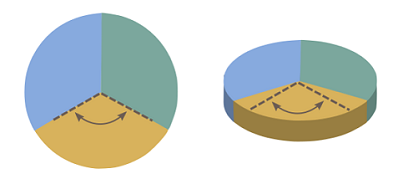
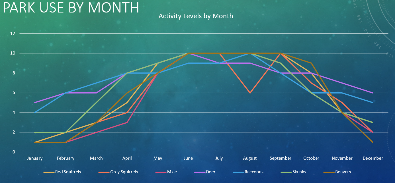
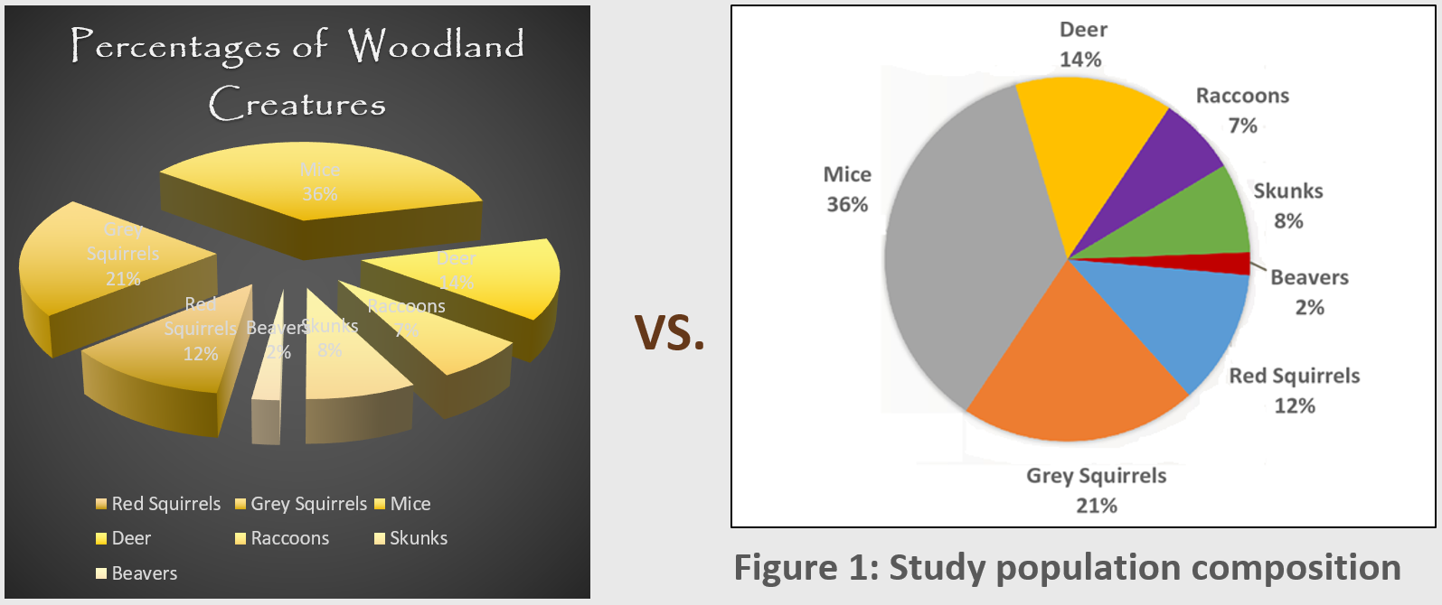
Cognitive load- Special Effects & Stacking
- Humans are awful at interpreting 3D graphics and clutter.
- 3-5 classes are ideal, 5-7 at most.
7. How important is consistency
Cognitive load- Consistency
Keep consistency between legends and graphics.
source: (Mandelbaum et al., 2012)
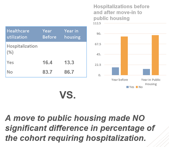
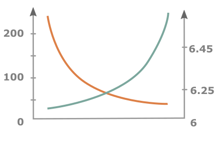
Cognitive load- Consistency
Keep consistency between axes, don't force correlation.
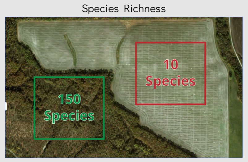
8. What can I do to improve the clarity of my graphics
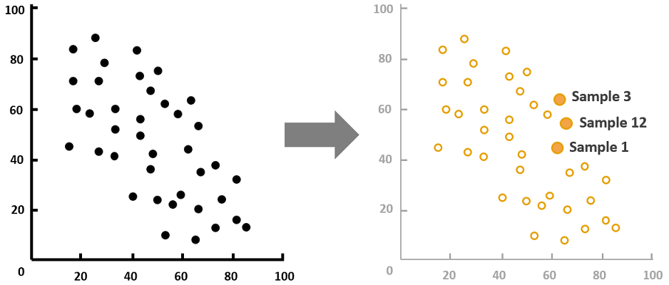
Cognitive load- Clarity
Use explanatory text and colour to create emphasis.
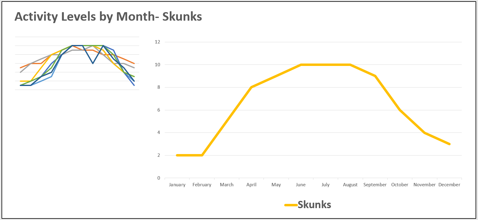
Cognitive load- Clarity
Use small multiples.

Cognitive load- Clarity
Keep it simple (and don't mislead the user).
9. What technology considerations should be taken into account
Technology- Reproducibility
Standard file formats and programs.
Human component
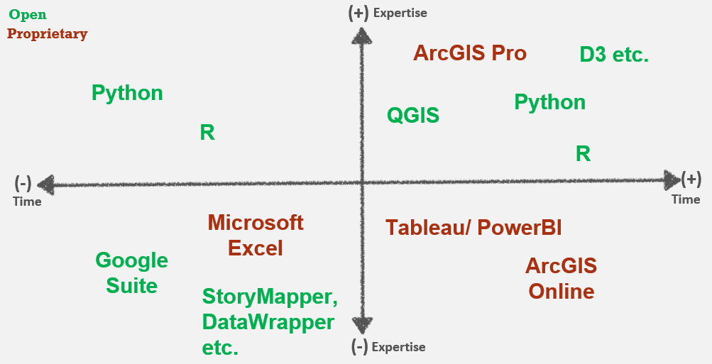
Technology- Considerations
10. How can I get started
Resources:
Data Visualization LibGuide
Don't forget about training resources!
Key points:
Message - be selective
Audience - you're creating this for them
Data - requirements and structure
Be kind to your future self.
Questions
meg.miller@umanitoba.ca
slides: bit.ly/uml_dvgbu